It's been over two years since I did a visual refresh of the blog.
Rather subject the site to yet another change of clothes, I think I'm going to rip out the whole closet and rebuild it from the studs.
I still like the current look but, Google's "Blogger" platform I've been using just hasn't been keeping up with modern features during the time this blog has grown to the online juggernaut of Arizona-based, DIY wizardry it is today. Blogger is great platform and it's inexpensive to run. It really is a wonderful way to get started and to test the waters to see if blogging is your cup of tea. Plus, before purchasing a custom domain name, it's free!
If you were here in the beginning, you were spellbound, sitting on the edge of your seat, feverishly reading the adventures of your hero on www.azdiyguy.blogspot.com.
If you've been thinking about blogging, go ahead and jump in! Blogger is a good (free and easy) place to start.
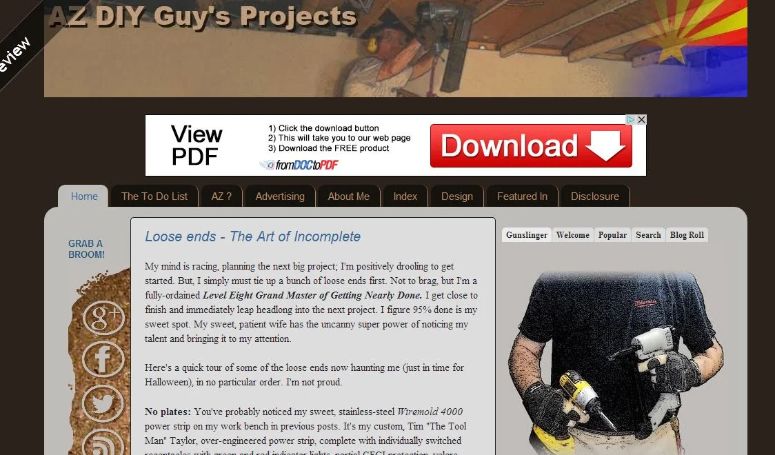
I started in 2012 with a fairly basic design, with a lot of stock Blogger widgets. Everything was shot on a camera phone, edited on free software, and typed up on the aging family computer. I don't have any pics of the original design, but here's one from the early era.
Now the blog is approaching 4 years old. I like the current look, but it's just not keeping up graphically and technically with modern features. I can't handle pictures the way I want to. I have to monkey around with coding to get stuff to work the way I want it. Because I've done so much of that, the easy template controls really don't work anymore. There's a just a bunch of behind the scenes tweaking I have to do, or should do, when I'd rather be writing or making sawdust.
Search Engine Optimization? Bah!
I'm always at risk that Google will decide to turn the whole thing off.
The site is optimized for mobile, but it's basically the same as every other Blogger blog. I can't edit it much. Fugly.
So, I'm experimenting. I'm working behind the scenes to explore moving to another host and blogging platform. I'm going to give the new site a somewhat similar appearance, at least at first. I don't want to make a jarring change. I'll probably reach out to a blogging friend or two at some point to help mentor me a bit, but I really want to do the work myself. DIY Guy indeed.
I also think I want to change my logo, but it's been tough. I've been using my "gunslinger" logo since the beginning. It was a quick cell phone shot with the background stripped out and a cartoon-ish filter applied, to use temporarily. Funny, I've designed many logos for others over the years, but I'm too close to this one to do it for myself. For now, at least as a placeholder, I've cleaned it up a bit, but it's still the headless torso you've come to know. Maybe it's too late; it's my online persona. Should I keep it or make a change?
I'm tinkering around with a new site design and navigation scheme, with a bunch more photo emphasis and current gen web functionality.
Here's a sneak peak at one of the leading, early designs. I'm adding functionality and room for future growth.
At some point soon, I'm hoping to take the leap. If you smell smoke and hear the sound of splintering timbers before I disappear into darkness, please bear with me. I'm not going anywhere. In that case, I'll keep you up-to-date over on my Facebook page.
I'd love to hear your ideas my friends. Feel free to share anything I should consider doing with this blog. Hit me up via the comments or a direct email. . I'd really like to hear from you.


